Pages

Wednesday, February 24, 2010

I Need TradeShow Advice!

I'm in way over my head~
I'm going to my very first big trade show in a few weeks and I'm suddenly having a panic attack because I know Nothing about setting up for a trade show!


Let me clarify why I specify "big" trade show...Mary Sue and I thought we'd set up a little table at a local business expo last December.  Neither one of us had the first clue what we were doing and just thought we'd try it out to see if it was a good networking for our new businesses.  We shared a table thinking "How much room could we possibly need?"   Ohh how naive we were~


This was our attempt at a display for photography and custom photo jewelry...actually not that horrible considering we had a little tiny table and not much of anything else!  This was taken with my phone camera...

The second we walked in we realized we were way out of our league!  We were surrounded by huge banners...tables and tables of professional products and displays...gift bags...handouts...you name it and it was there.  And this was a small expo, only about 200 people attending.  The good thing is that I got a lot of ideas but also recognized that I need soooo....much.....more....


So this is where you come in!  If you've ever set up a booth at a trade show I'd love to hear your favorite tips and advice.  And if you've ever attended a trade show I'd love to hear what draws your attention when there's so many businesses in the same venue.


Here's a little info for you so you know what I'm getting into...
~ this trade show is at a local high school in an upscale community with about 6,000 people attending the expo every year.  
~ most of the businesses are like mine, they're not selling anything that day, just advertising their services.
~ I will be advertising my Family Photography business in hopes of getting new client bookings.  This show is very family oriented so I do believe it's a good spot for potential clients.
~ I'm on a budget people!!  I'm new to this so I have to start making some money before I can start putting a lot back into it...it's a vicious circle....
~ The booth I have is a 10' x 10' space.  I'll have 2 8' tables and 1 card table to set my giveaway forms on.  Every business has to offer a giveaway.
~ They'll be about 160 businesses there so it's gonna be busy!
~ The hours are from 9:30am til 4:00pm, one day only.


I do have a few things already....my colors are black and pink so I've got black table covers with a little bit of pink tulle to lay over the tops and scallop at the edges...something like this...

I want the black/pink thing to be pretty consistent so I'll be wearing those colors and so will my bestest friends that I've begged to come with me...I've heard that "appearance is everything" so I've wrangled Raindog...

...and Alexis' Mum...

...into spending the day with me so at least my booth will look good!  And Princess may even make a special appearance wearing this outfit...

...with plenty of attitude to match!  So I may not sell anything but I'm bettin' I'll have the best looking trade show models around~


I'm pretty stocked with biz cards...I've got a banner...and these canvas' to display...

I've also got the cutest little easels to display some postcards...this was taken with my phone camera too so not the greatest quality but you get the idea...

Now it's your turn ~ What am I missing?  What one fabulous tip will make all the difference?  What would make YOU stop and take a look?  I Need Help!!


I'll be sure to take plenty of pictures while I'm there too and tell you all about it...I'm excited...setting it up is half the fun!

Monday, February 22, 2010

More Ways To Finish It

You've probably read all the hype lately about mcp actions new set Finish It.
Well, you're about to read some more!


I was fortunate enough to be a tester for this new set and I had so much fun playing around with it.  I've never really used anything like this before for framing or branding so I was actually a little skeptical about how much I would use it.  But these handy actions have lived in my photoshop elements palette for about 3 weeks now and I've referred to them way more than I thought I was going to.  


I'll skip the technical explanation...Jodi explains all their fabulous benefits on her site, but basically these actions enhance the way you present and prepare images for the web.  I'll just show you a few of the ways I've used the different options...and keep in mind these were created in Photoshop Elements so that's a huge plus that they're compatible with Elements~


This is an example of the Brand It Bottom Framed...I changed the bar color to pink and added my logo with the Branding Iron
*the black border is added by my blog, not by the Finish It set*

I like this...I think the frame adds an artistic touch that I would have never pursued if I hadn't been trying out these actions.


Here's another using the Frame It Oversize Frame...

There's also circles and ovals in the Round It set which I have never done before but I'm liking that extra little artistic flair it adds...


I really like the color bars that I'm able to add with the Build It...these would be great for making greeting cards or invitations...

And here's another color block with the Brand It option, they're very versatile and I can change any colors of the bar or the strokes...

...here's the screenshot showing the layer options I have when working with this...the big yellow X shows where I clicked to change the color of the skinny white border between the photo and the color block.


So my "unofficial review" of the Finish It set is Excellent!  The option I use the most is the Size It which quickly sizes my photos for the web so it doesn't take forever when I'm uploading pics for my blog or facebook.


One thing I wanted to point out though...I've seen a ton of fabulous examples of how pro photographers have used this action for their professional portraits.  Obviously this set is ideal for anyone doing a lot of branding or posting a large amount of pictures to the web, but it's not just for the big time pros.  I was using it on some soccer shots to send to the family and I love how it gave them a....finished look!  What a perfect name!


So don't be intimidated...the Finish It set is for everyone!  Head over to mcp actions and check it out!

Friday, February 19, 2010

My Canvas On Demand

Is it just me, or does anyone else get ridiculously excited when the delivery truck pulls up in front of your home?


Last week was a rare treat for me because the delivery was actually for ME!  Trust me, when you have 4 kids and a husband who owns a business, the packages are never for mom:)


My Canvas on Demand was delivered and I finally got to see my Princess on the Steps that you all voted for in all of it's 16x24 glory~


I thought I'd take a lovely picture for everyone to see of beautiful children standing by my new canvas...but unfortunately my real children were the only ones available and this was the best shot I got out of about 20 attempts...

I can't explain those expressions...I just can't~


So here's the scoop...I saw their ad on another site and thought I'd give it a try.  I'm doing a trade show in March {more on that later} and I'm trying to build up a nice set of display samples on a very tiny budget.  
I signed up for a PRO account thru my photo biz and received a voucher for a discount off my first purchase.  


The order process was very easy...it's definitely aimed at 'the novice' and not as difficult as ordering thru professional print labs ROES software.  The pro online ordering was a simple page of choosing your options and the regular ordering page is very similar....here's a screenshot from their Order page....
There's plenty of pictures to help explain the options which I personally think is awesome.  I need pictures!  What I also thought was really cool is that you don't have to have a digital photo to upload.  If you've got an older photo that's not living in your computer there's an option to mail it in and it can also be made into a canvas.  How neat!


Another option that I haven't seen in other sites is the edge color options...you can choose from Black, White, Photo Wrap or Match the Color.  I chose Black.  If I hadn't been in such a hurry I would have done the photo wrap but I was too excited to order it and didn't want to re-do the proportions!


Also, let me tell you about their very helpful Customer Service.  Me, being the *brilliant* pro that I am, uploaded my picture and thought I had sized it correctly for a 16x20.  I didn't.  Their Customer Service department emailed me, very politely, informing that my photo wasn't sized correctly and it would need to be printed to a 16x24 to maintain the proportions.  They took care of it for me free of charge.  You don't see that every day!


The packaging was very secure and it arrived 6 days after I ordered it...I love fast shipping!


Alexis's Mum stopped by right after I got it and I just had to show off my new canvas.  It took her all of 7 seconds to write me a check so I could order her own canvas.  She ordered this one:


It's stunning to see in person...it's a 16x24 and I'm tellin' ya, bigger is better!


So there you have it...I've found something I love and now hope you love it too...and if you order a canvas you can submit your review on their site and they'll feature a picture of it with your story...love that too!  I think my review is #11 in the Kids Showcase category, check it out~


300x250 CanvasOnDemand banner


I've got more before & afters coming, a new obsession that's little tiny and I need your advice badly on a trade show I'm doing next month...so Stay Tuned!


Wednesday, February 17, 2010

Help For Red Winter Cheeks!

This photo...

...was made possible with the magic of actions!

I'm not exactly a cold weather kinda gal...but this Ohio winter has forced me to venture out in the snow for a few snow shoots.  And you know what comes with snow...snotty noses, dry skin, chapped lips and bright red cheeks!  Those non-photo-friendly things are exactly what I was faced with when looking over my latest shots from a snow day at the park~

But, thanks to my newest favorite action, Baby Powder Room from Coffeeshop, I've been able to find a quick fix for those red winter cheeks and wanted to pass along this fabulous tip to you!

It's really so simple...
1.  I opened my original photo in Photoshop Elements 6 for Mac:

As you can see those cheeks are bright red from playing out in the cold and she's got a big scratch on her right cheek.  I used the Healing Brush Tool to get rid of her scratch then I ran Baby Powder Room action to lighten the red on her face.  This action has a Red Skin Repair layer that is specifically for lightening red skin...wow!  that's just what I needed!
Here's what it looks like with the action open:

2.  All you do to repair the redness is click the "i" key to activate the eyedropper tool.  Then I click the eyedropper on the skin that is NOT RED!  This will determine the color that I'm going to try and duplicate instead of the red.  

Next I choose my Brush tool and a low opacity setting and lightly click on the red cheeks, which are amazingly being replaced with the non-red skin wherever I click.  Disclaimer:  These are not the technical directions...please read Rita's directions if you download this action for a much more thorough explanation...mine is the lazy version:)

After I get the redness toned down then I proceed as normal with the Smooth Skin, Bright Eyes and whatever other edits I want to make.  After I completed the edits on her face I ran Coffeeshop Vivid 2 and chose the Bright option.  Here's the before & after:

Yeahh!!  You'd never know this little beauty was romping around in a foot of snow and 20 degree weather!

Here's a few more before and afters from this shoot...all of these were edited with Baby Powder Room to repair the little red cheeks...

here's the screenshot after doing the Red Skin Repair but nothing else...

and here's the after...

before...

...after

So if there's anybody else out there suffering thru the terrors of winter, maybe this little action will help ya out!


Monday, February 15, 2010

Save $10 On A Custom Logo & Watermark Kit!

If you have a business, you need a Logo.
If you have a group or organization or blogsite, you need a Logo.
Basically, if you have anything you want people to remember and recognize by sight, 
you need a Logo!


I just went thru the process of having a custom logo designed for my photography business. It was so much fun and the anticipation of seeing my very own logo was very exciting.  When I kinda, sorta started my business last year I thought that custom logos were only for the 'big guys'...but, as usual, I was very wrong!


When I first started posting my photos and they were being viewed by potential customers, I had no watermark to let people know who had taken the photos.  And I thought that adding a graphic to my precious "works of art" would be distracting, but now that I have my logo I can't wait to add my graphic and let everyone know "...look what I made!"


For instance, people may enjoy seeing this photo in a facebook album...

...but this photo may encourage them to look up my website or find out more about my business...

But here's the thing, logos aren't just for photographers!  I have several friends who have just started businesses...custom jewelry, image consulting...and I've been asked to do some brochures and various marketing items for them.  My first question to them?  "Can you send me a copy of your logo?"  They don't have one!!  There's nothing distinct on their marketing to begin "branding" their business into people's brains!  Hopefully my harassment and public humiliation of them on my blog will encourage them to finally get a logo!


When I decided to have a custom graphic designed I spent a whole lotta time looking at different designers but finally decided on Heather, who is officially titled Rita's Lil Sis from Coffeeshop.  Her prices were reasonable and her design gallery was filled with creative and distinct logos.  Here's just a few that I took as a screenshot from her site:


When I saw these I had no doubt that she'd be able to deliver exactly what I was looking for:)


Heather earned her keep while working with me!  I had a quite a few "requests"
 such as:
1.  My colors are black and pink.
2.  Nothing cutesy, flowery or silly.
3.  BOLD...I don't mind attracting attention!
4.  I wanted a "graphic" that was able to stand alone and also a logo with text that included my full photo biz name.
5.  I wanted a black & white version and also a color version.
6.  I wanted it quickly!!!


Heather was very gracious in obliging all my requests and answered every stupid question I had quickly and thoroughly.  Here is what she created from my very specific wish list...

I was flippin' out when I saw it...I would have never been able to describe that to her but somehow she created the perfect thing.  She sent me several formats and versions so I can use it on photos, business forms, coffee mugs...whatever I want to do with it I've got a format that will make it happen~


After I got my logo I had to go about the task of applying it to my photos.  At first I would just open the file, drag and drop it on my photo, resize and move around...blah blah blah.  Let's just say I took the long way!  Finally I decided to give Rita's Coffeeshop Watermark Action Kit a try...guess what...it's made specifically for applying logos to photos quickly...who knew???  


Here's an example of just using my black & white "graphic" without the text on a photo.  I would like that graphic to be recognized on it's own eventually if I don't want to take additional space with the added text.  I used the Drop Shadow option from the Watermark Action Kit.
And here's an example of the Frame It option using my entire logo in black & white:  (the thick black border is added by my blog, not the Frame It option)

{by the way...I've got an Anatomy Lesson coming soon on that pretty little girl in the pink!}

So there's a few examples of how life is great with my new logo and Watermark Kit...but don't let me be the only one enjoying life...you can too!

Not only is Heather a logo designing genius, she's also very generous:)  She's offering a 
$10 Savings
on the following package:   You will get:
A.  Custom Logo designed by Heather specifically for you
B.  Coffeeshop Watermark Action Kit 
For the total price of $110
(normal price is $120)
This package deal is good thru February 28th so be sure to contact her quickly and get working on your logo!   Use the code "inspired" when requesting her services so she knows that Inspired by christy sent you~

One last thing...if you get a custom logo made I would love to see it!  Upload a picture to my Inspired by christy Fan Page on facebook and strut your stuff!


Thursday, February 11, 2010

The Left & Right Of It

This photo...

wasn't born this way.

Check out my post at TexasChicksBlogsandPics to see how angling just a tad to the left can make a big impact on your photos!

Tuesday, February 9, 2010

Out Of My Element

I'm on a quest this winter to find some new shooting locations and try out some new photography styles.

The majority of my shoots have been at beautiful parks with lots of "natural" texture such as trees, stone walls and my favorite - weeds:)  So I was thrilled when I found the Trainyard that offers lots of new textures and color.

Unfortunately,  Ohio winters are cold, dreary and overall yucky and I'm NOT a cold-weather gal...so my quest isn't progressing as quickly as I would like.  But I managed to sweet-talk some friends of mine into being my models one Saturday morning when we actually almost hit 50 degrees.  They were wishing it was warmer but I told them to "Suck it up...I'm on a quest!"  Amazingly, we're still friends!

My goal for this shoot was to do two things that I rarely do:
1. Include the Surroundings ~ My first instinct is to get real close...these type of shots are my favorite...


I really wanted to make the best use of the surroundings and try something new.

2.  Use the Color ~  I really like working with High Key black and white.  I also do a lot of muted or hazy tones because I like the "timeless" feel they often add to the photos.  So I specifically looked for color and tried my darndest not to imagine the shots in black and white!

I'm rambling about all this to you because this little experience with a specific "goal" in mind really helped teach me a lot...and maybe you could do the same~

So here's a few of the final results and of course I've got a Before & After at the end because I'm a B&A freak!

Likin' this blue door here...

...and I definitely found some color in these next two...


...and I think I can give my next one an A for Effort in both the color & surrounding catergory...what a great prop!

Now for that Before & After:
1. I opened my original pic in Photoshop Elements 6 for Mac:

2.  Then I used Coffeeshop Powder Room 2 to soften the skin and Erin's Defog for a little oomph.

3.  Next I used 2 textures...
ShadowHouseCreations Scratch the Surface 5 
( I lassoed the face and added a gaussian blur to remove the texture from her face)
Lustre cool from Flora Bella
I changed the hue/saturation on this texture because I liked the texture but not the color enhancement.
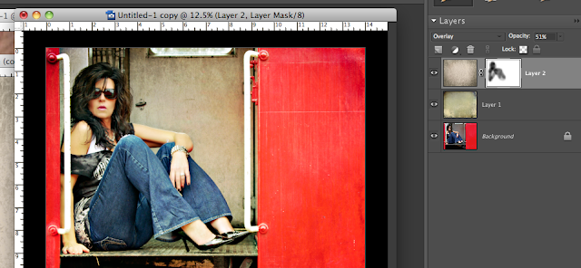
Here's my screenshot...I changed the hue to  -104

4.  Next I added a layer mask to the lustre layer to remove some of the texture from the subject.
Here's my screenshot:


5.  I ran the Coffeeshop Action Vivid 2 and selected the Soft option then added my snazzy new logo with the Coffeeshop Watermarking Action.  If you're always adding the same logo or text to your photos then this action is perfect for you and will save you a ton of time!
Finally, here's my finished product....


So set some goals for yourself and have fun experimenting with new angles, new views and new attitudes!

...and if you haven't checked out my Stuff I Love pages, be sure to take a look~  I'm adding new links every day and if you've got something that you think belongs in one of my lists, let me know about it!


I Heart Faces ~ Kisses!

This week's theme at I Heart Faces is KISSES!

Although I had plenty of "technologically correct" photos to choose from, I'm kinda liking this one I took  a few days ago of myself & my Princess.

This was taken with my phone camera....which I rarely use but my kids love it!


Check out I Heart Faces for all the great entries and join the fun yourself!

Sunday, February 7, 2010

Rockin' The Blog With Rita & Heather!

Soooo...notice anything different???
I'm Rockin' the Blog with Rita & Heather!


The wonderful and talented Rita from Coffeeshop  designed this great new blog for me and I'm having so much fun with it already!  


Let me tell ya, my Wish List for a new blog wasn't exactly simple. But Rita was so patient, informative and  super-quick to return my emails with all of my dumb questions answered.  


Let me break down for you what I'm really enjoying about my new blog:


1. The Sidebar ~
I've been wanting to add a sidebar to make all my stuff easily accessible but I didn't want to distract from pretty little photos like this one~


I think the color combo we came up with works well and isn't too horribly distracting from the main post.  Now I'm able to display a few of my favorite links on the side plus I've got links to great photo gear, the button to subscribe to wayoutnumbered (it's easy!), my blog archives, a "follow me" link and a facebook button for my photography biz, just in case any of y'all have ever heard of facebook~

2.  The Background Graphic ~
I figured if I was going to give this photography business a whirl then I should have an "official" logo.
So I contacted Heather   {her official title is Rita's Lil Sis}  and she worked me up this FaNTaStiC logo:


Didn't she do fabulous?  Subtle was not one of the requirements when building this logo!  
I used this graphic as my background on my blog and I love the fact that it's unique to me.
Heather was just as nice as Rita in answering all of my dumb questions, emailing me proofs and providing me with all the little extras I kept asking for.  Fabulousness must run in that family!

I've got plenty of projects on my wish list for Heather...such as whipping me up a cute little blinkie like all the cool bloggers have...check her out if you're wanting a logo, graphic, blog button or blinkie...she highly exceeded my expectations:)

3.  Stuff I Love ~
The Stuff I Love pages are undoubtedly what I'm most excited about.  I get questions all the time asking about products I use, editing software, sites I visit and tons of other stuff.  With my new pages I'm able to list everything I love and it's easily accessible all the time, you don't have to go searching thru archives. 

I've listed my absolute favorite texture & action sites with links directly to the their home page.  If I've used their textures and love their products then they're included in my Stuff I Love pages.  It's a very exclusive club and I'm sure they'd all be very honored to be included...if they knew I existed!

I've got links to learning tools, the coolest printable cd's and even my dream camera ~  I will rock the photo world when this camera is in my hands ~
Be sure to check out my Stuff I Love pages and let me know if you've got a product or site that you think deserves to be included.  I'd love to check it out!

4. My Slideshow Header ~
I feel completely silly about how fun it is to see my photos in a slideshow!  The slideshow was Rita's idea and she sent me a ton of templates to choose from, it was so fun!  Even though she has tutorials on how to do all this stuff I would have never thought to do it myself.  

The instructions were very simple to understand and I was so proud that I built it all by myself in photoshop elements...but that's where my bragging stops because I have no idea how it went from a flat .jpg like this...
...to a real live moving slideshow!  Yes, I take joy in the little things~

I hope you enjoy my new blog design and find lots of helpful information.  I love sharing my photo successes and failures with everyone and really like the fact that this is the only place in my life where I can voice my opinions uninterrupted!  If you have kids at all (or dare I say a husband?) then you know that everything is interrupted!

I've got lots more features I plan on adding so keep checking back and I'll be sure to fill you in on all the cool stuff.  And leave me a comment if there's anything you'd like to see that I haven't added....I'm always up for new ideas:)

If you'd like to add any of these features to your blog you can find all these tutorials and more over at Coffeeshop.  Rita has tips and tricks for everything related to blogger blogs and plenty of new tips on the way...such as how to make the best use of bloggers new static pages...how exciting!  I can't rave enough about her fabulousness and there are not enough words to express my thanks~

Rita & Heather Rock!
 
Blog Designed by Rita of CoffeeShop