I'm on a quest this winter to find some new shooting locations and try out some new photography styles.
The majority of my shoots have been at beautiful parks with lots of "natural" texture such as trees, stone walls and my favorite - weeds:) So I was thrilled when I found the Trainyard that offers lots of new textures and color.
Unfortunately, Ohio winters are cold, dreary and overall yucky and I'm NOT a cold-weather gal...so my quest isn't progressing as quickly as I would like. But I managed to sweet-talk some friends of mine into being my models one Saturday morning when we actually almost hit 50 degrees. They were wishing it was warmer but I told them to "Suck it up...I'm on a quest!" Amazingly, we're still friends!
My goal for this shoot was to do two things that I rarely do:
1. Include the Surroundings ~ My first instinct is to get real close...these type of shots are my favorite...
2. Use the Color ~ I really like working with High Key black and white. I also do a lot of muted or hazy tones because I like the "timeless" feel they often add to the photos. So I specifically looked for color and tried my darndest not to imagine the shots in black and white!
I'm rambling about all this to you because this little experience with a specific "goal" in mind really helped teach me a lot...and maybe you could do the same~
So here's a few of the final results and of course I've got a Before & After at the end because I'm a B&A freak!
Likin' this blue door here...
...and I definitely found some color in these next two...
Now for that Before & After:
1. I opened my original pic in Photoshop Elements 6 for Mac:
2. Then I used Coffeeshop Powder Room 2 to soften the skin and Erin's Defog for a little oomph.
3. Next I used 2 textures...
ShadowHouseCreations Scratch the Surface 5
( I lassoed the face and added a gaussian blur to remove the texture from her face)
Lustre cool from Flora Bella
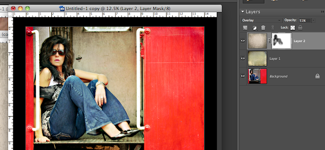
I changed the hue/saturation on this texture because I liked the texture but not the color enhancement.
Here's my screenshot...I changed the hue to -104
4. Next I added a layer mask to the lustre layer to remove some of the texture from the subject.
Here's my screenshot:

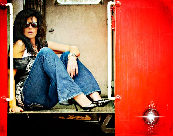
5. I ran the Coffeeshop Action Vivid 2 and selected the Soft option then added my snazzy new logo with the Coffeeshop Watermarking Action. If you're always adding the same logo or text to your photos then this action is perfect for you and will save you a ton of time!
Finally, here's my finished product....

So set some goals for yourself and have fun experimenting with new angles, new views and new attitudes!
...and if you haven't checked out my Stuff I Love pages, be sure to take a look~ I'm adding new links every day and if you've got something that you think belongs in one of my lists, let me know about it!


6 comments:
You know I *am* going to sit down one day and try to replicate what you've done here - it's gorgeous!
Are the Coffeshop actions free, or do you have to pay for them?
I've not really dabbled much with textures yet, I'm not sure where to start. Do you have any tips or go-to sites where you learned what you know? Would be much appreciated to be pointed in the right direction. :)
We are in Illinois and it is cold and snowy here so I ventured into a local Coffee House with a HUGE window that lets lots of natural light in and now that is my go to place to shoot in the winter months!! Great colors and textures!!
I am just starting out with Photoshop Elements 8. I was wondering the same thing about the textures as Marylin. I have downloaded a few of the Coffeeshop actions.....I love them! I was wondering if when you download textures if you put them in the same file as the actions or do they go in the file named backgrounds? I appreciate any help you can give me! Your pictures are gorgeous! Someday I hope mine will look like yours. One more question. Is there an action you would recommend for making food photos look better? Thanks~Denise
Marylin~
To answer your questions...Coffeeshop Actions are FREE! She has also has fabulous tutorials on editing and blogging so I highly recommend viewing her site.
Also, check out my Stuff I Love pages for all my favorite texture/action sites and most of them are free or very inexpensive~
Thanks for the great questions!
Cottage Sisters~
When you download textures they are the same as "regular photos" and do not need to be downloaded into your editing program. I would recommend making a Textures folder and maybe even breaking it down from that such as....Darks, Scratches, Pastels, etc. After working with them a while you'll soon start to become familiar with your own library and find the right texture faster.
Thank you soooo much! That is a big help.....I will be playing with textures this afternoon after work. I am new to the whole photography and photo editing, there is so much information sometimes I feel like I'm trying to learn a new language, it can be a little overwelming. Thank you for all the information you put up on your site, it has been a huge help!
Post a Comment