Pages

Friday, January 29, 2010

I Heart Faces ~ Fix It Friday!

I haven't participated much in the "Fix It Friday" theme from I Heart Faces, but this picture really caught my eye.  The girl is gorgeous and the feel of the photo is lovely...


..so of course I thought I'd edit most of the girl out and mess it up as much as I can!  I've said it before, I have issues with normal photos:)


Here's the original...

I softened her skin  just a little in Coffeeshop Powder Room 2 then started adding the textures.
I added Shadowhouse Creations Heavenly Vintage Baby Blue then flattened and thought I was done.
I wasn't.

I cropped it to the left for a little drama.  Can you have too much drama? 
So next I added Smoke from Kaleidoscope and Attache cool from FloraBella and erased most of the texture off her face.  Here's the layers palette:


Then I ran Coffeeshop Faded Daydreams action, flattened, and added 1 more texture because I'm a texture junkie.  I added Memory warm from FloraBella and erased most of the texture off the middle of the photo and thought I was done.
I wasn't.  But here's that layers palette:


Lastly I duplicated the layer, set it to Multiply blending mode and erased most of the middle out of the top layer so the lighter layer underneath would show thru.
Here's the final....

My snowman is looking a bit odd but it's just for fun so I won't stress. 
I may try more of these challenges because it's such a different experience to edit someone else's picture...

Head over to I Heart Faces to join the fun and see all the other great Fixes today!


...one more thing...your votes on my Dilemma were sooo helpful! I'm definitely rethinking what my first instinct was for the canvas...I'll be sure to let you know soon which one I chose~

Wednesday, January 27, 2010

Dilemma

Here's my dilemma....
I have a voucher for a FREE canvas from Canvas on Demand.  Yeahh!!
I'm all about the free stuff.


I'm going to attempt to do a few local trade shows this year to shamelessly promote my photography services so I was thinking that this was a great opportunity to get a nice sample for the shows.  But I just can't figure out which photo to choose...I'm not necessarily looking for the prettiest photo but the one that showcases my unique style the best and is also an attention-getter.


Here's the ones that I'm debating over...these are some of my newest creations...


...really liking this one with all the texture...would show off well on a 16x20 canvas...


...liking this one too because of the awesome color...


...luvn' my Princess here...again with the texture thing...would show well on canvas...


...not quite sure how this would look with the canvas material but love this shot...


...just too cute...definitely shows a unique style...great color too...


So there ya have it.  I just can't make up my mind!!
I'd love to hear your opinions.....send them over~


BTW - all these photos were taken at The Old Trainyard....more of these to come along with tutorials:)

Monday, January 25, 2010

I Heart Faces ~ Texure Theme

The theme at I Heart Faces this week is "Texture".


Hmmmm.....wonder if I have any photos using texture????


The focus I believe is using texture in unique and interesting ways in photos with faces.  
I think this photo represents unique & interesting....it's one of my favorites~


Join in the fun yourself over at 


and be sure to check out all the other great entries this week - you're sure to be inspired!

Thursday, January 21, 2010

A Day With Grandfather's Family

Last fall I had the honor of photographing this fun family...


I think it was a rare instance for all the family to be in town together and the proud grandfather wanted to capture this time with some unique photos.  Lucky for him I do 'unique' well!


I snapped some group shots, some family shots and then, as it usually goes, I spent the majority of the time on the individual shots of the grandkids.  The grandkids always get all the attention!


Let me tell ya, this family was a blast to spend the afternoon with!  They were joking, laughing and truly enjoying their time together and I was thrilled to be a part of it.  Overachiever was hauling around all my gear that day and he even got involved in the shenanigans with the rest of 'em!


I wanted to share a few of the photos I created for this family...


This girl was AbSoLuTeLy a fantastic model!  She was up for anything and didn't even mind laying down on the cold rocks for me...


Her little brother, on the other hand, wasn't quite as comfortable in front of the camera:)  I spent a good part of the day telling him..."No, the other way....No, the other leg....No, your other left!"  Yes, he was K I L L I N me which of course just added to the laughter.  I actually quite surprised myself that his portrait edit is actually one of my favorites.  Here's the original:


And here's the final...I like the soft intensity, if there is such a thing~


The second family had 2 sisters that were just a dream to photograph.  
I liked the softer side that this photo shows...


...and the edgy side that this photo shows...


This 'together' shot of the 2 of them turned out Stunning!  Actually every photo of them together just captured such an incredible mood, they were fabulous. I had this printed large on metallic paper to really show off those eyes...metallic paper is my newest obsession...it adds such a shimmer and a radiance to the colors~


And for you Before & After freaks here's one of my "non-poser" that was kind of fun:

Original...


I added 3 textures:
Reverie warm (Flora Bella Collection)
Watercolor vignette 
Dream Sequence IV (both from Kaleidoscope)

Then I added some layer masks and erased a little bit of the textures off his face. 
Here's my layers palette:


Next I ran Coffeeshop Lomo action and Erin's Defog.  


Here's the final...I like the spiky things in the background!


Monday, January 18, 2010

Anatomy of...The Old Trainyard

Last fall I was quickly thrown into the ring of "photography business" thing and didn't really have a chance to scout out a lot of shooting locations.  So my mission thru the winter is to uncover some new shoot spots with tons of *character* ~ *texture* ~ *color* ~ and the *unexpected*.


So I planned a day this past weekend to head to the Old Trainyard with my aunt & uncle who are also major photo freaks like myself:)  It was cold, slippery and muddy but well worth the trip ~ I'm totally psyched to start shooting there!  (do 30ish year old women still say totally psyched???)


It had several of these around...


...and this grungy red door...


...and check out this great pop of color...


...and I've got big plans for this spot right here...


One of the neatest features was this retro little set-up...


I wanted to add a touch of eerie drama to this little spot so I added a few textures:
Buttermilk Heavenly Vintage from Shadow House Creations
Vintage Dream Sequence II from Kaleidoscope


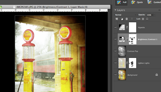
Then I ran Coffeeshop Bold Pop  to "pop" the colors! I darkened up the train in the background just a little though on the layer masks that were provided in the action.  Here's my layer palette for the Bold Pop action:


Next I ran the Coffeeshop Orton action to soften it up a little but erased the gas pumps so they would be a little sharper. Here's my layers palette for the Orton action:


Last I added 1 more texture from Shadow House Creations Elemental Grunge set to finish up with this:


I can't wait to shoot here!!  It's gonna be Rad, Totally Awesome, and all those other words that are way outdated but I'm gonna use anyway~


Are you in need of a little shooting inspiration?  Load up the kids, take a ride and do some scouting...I'm certain that somewhere, not too far away, you'll find something fabulous!


Wednesday, January 13, 2010

Wish I Had Known This Earlier!

I did something very unexpected today...are you ready for this...I read my Photoshop Elements Manual!!


Yep, I dug it out of the drawer and took my own advice about "Reading The Manual"and I actually learned something~


Here we go:
I'm always applying Layer Masks...and erasing...and selecting...and masking...and blah blah blah...
Today I read up on the Selection Brush Tool which I have NEVER used before!


It's basically another option for painting the areas you want or masking the areas you don't want. 
It's kinda hard to explain...I'll just show ya~


1. I opened my original pic in Photoshop Elements 6 for Mac.


2.  Then I chose my Selection Brush Tool which is here, hiding under the Quick Selection Tool:


3.  What I want to do now is "Mask" the parts of the photo I don't want to manipulate, so I make sure Mask is selected in the options bar:


4.  What I'm going to attempt here is to mask part of the photo then turn the rest of it black & white.
     I'll size my brush to the size I'm wanting and click on the parts I don't want affected (her eyes).
     I duplicated my Background first...make sure to work on the copy layer.  Here's my little alien child    
     with her eyes masked red:


5. Now I'll go to Enhance - Convert to Black and White and choose which B&W option I want.  The idea here is for everything except the masked parts to affected:


Here's what I end up with...my selections weren't perfect, I got some of her hair in them, but this is just to give you an idea of what this tool can be used for.


Now, just because I have nothing else at all to do today, I'll show what the other option for the Selection Brush does:


1.  Open my original pic in PSE:


2.  Choose the Selection mode in the options bar for the Selection Brush:


3.  I duplicate my layer then paint with the brush the parts of the photo I want to Select or manipulate (her sweater):


4.  The sweater has a little bit of a blue tone to it so I'll try to alter the saturation to see if I can get rid of that.  I choose Enhance - Adjust Color - Adjust Hue/Saturation:


5.  Now I'll scale back the Saturation slider and watch the screen until the color looks how I want it to.  In this case I scaled it all the way back:


So here's my final after selecting (so easily!) what I wanted to change then applying the adjustment. If I were doing this "for real" I would have made sure not to desaturate the weeds too, but I was too lazy to deselect them...you get my point!


And because I'm a Before & After freak....here's the B&A!


I am so LUVN this handy dandy little tool I found!  
Why didn't anybody tell me about this earlier?!?!


Tuesday, January 12, 2010

i heart faces best face

iheartfaces has the "Best Face" challenge this week.


To participate you have to enter a favorite face photo that you took in December or January.


...that smirk...that dimple...that lip gloss from nose to chin!  ...just a few of the many reasons this is *one* of my favorite faces~


Head on over to iheartfaces to check out all the great entries this week and join the fun yourself!


Monday, January 11, 2010

Even More "Now What?"

If you read part 1 of "Now What?" over at TexasChicksBlogsandPics then you definitely won't want to miss the exciting Finale!


Check out part 2 here and see how stalking helped me get this great shot!


Sunday, January 10, 2010

Desperate for Metal

I'm desperately wanting one of these:


No, not the Photoshop guru or the intimidating football player. (although both would come in handy to have around!)


What I'm desperate for is one of those fabulous metal prints that Scott Kelby is so proudly displaying.


Metal prints seem to be all the rage right now in the photog biz.  I love scouting for cool and unexpected products to display photographs and this metal option is my newest obsession.


The photographs are printed on aluminum and there's lots of options for the finishes such as high gloss, satin, white aluminum, brushed and more.  I got the sample pak from ImageWizards, which is where Mr. Kelby's photo was from, and it's pretty snazzy.  They included 4 small samples with different finishes and I was surprised at how different the same picture looked using the different options. The colors were amazing in all of them and seemed to have a glow about it.  


The budget doesn't quite allow for a metal print just yet, Image Wizards is pretty expensive in my opinion but I was trying to decide which picture I would choose if I could have one for myself.  I think I would print this one of Wild Child, I love the colors and think it would really show off the glow of the metal~


I've tossed around the idea of doing some trade shows this year and thought if I had a print done for display I'd probably use one of these to make the colors pop~


Image Wizards aren't the only printer that does the metal, but they're the only ones I have samples from.  Bayphoto.com has a great selection of metal products and they're pretty affordable too.  They've also got these cool photo dog tags that I would love to try out:


And they have the floating metal prints with a print on a print:


I just love it all!!  
So here's my question to you:  
Has anyone ordered any of these metal prints?
If so, where did you order it from and do you think it's just the coolest thing?
If you haven't ordered but know of some other great places for metal stuff pass along the info ~ I wanna know!!


Blog Designed by Rita of CoffeeShop