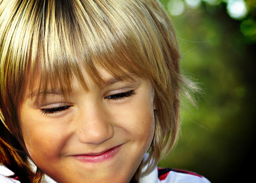
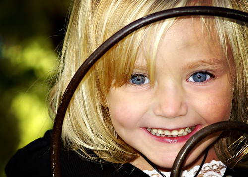
I love photos like this...
...and this...
...where those beautiful little people fill the entire frame.
But in my recent quest to challenge myself in photography, I've been forcing myself to STEP BACK.
I've been realizing that quite often S P A C E can really add to the impact of the photo.
And I'm still all about impact!
You know I've got some examples for ya so here ya go!
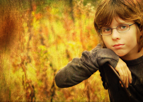
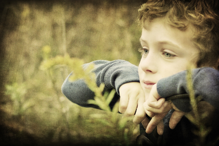
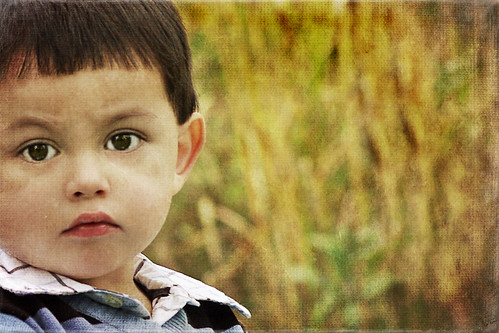
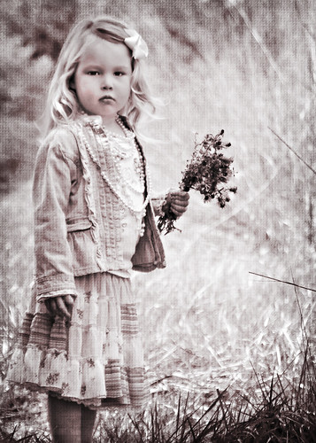
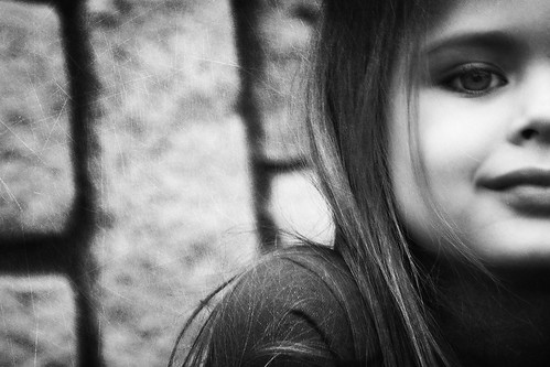
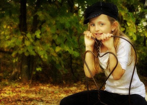
In the majority of these photos the main subject is less than 50% of the frame, but I think the space that's been added really gives these photos their OOMPH!
What do you think? I'd love to hear your opinions on this post and anything else that can encourage us to find
new angles, new views and new attitudes in photography and life!
On another note...
Several people have asked for tutorials. Trust me when I tell you that I'm NOT a photo snob who won't share "my technique" with the masses. Problem is, I really have no magic technique!
I'm pretty much a hacker when it comes to editing. The several photos I've started to use on a tutorial I've ended up doing like 32 different things to them and it just got to be too much to post in a tutorial. Sooooo...I am seriously going to try and edit a photograph with a few simple textures and actions and show the process as easy as possible.
Stay tuned...




6 comments:
These are gorgeous! *sigh* I'm not sure if this is somewhere and I missed it, but what kind of camera do you currently use?
Thanks for the encouragement Marcee!
I'm using a Pentax k10 which is a 10mp. I switch between my 70-300 lens and my 28-300 lens in my photo shoots. I'm desperately craving a Nikon d300 though and am working hard to save my pennies for it!
I have just found your blog and already you have taught me something - step back. I am the grandmother of three precious girls and I have a tendency to fill the frame with their beautiful faces. I am going to make a concerted effort after seeing your inspiring photos.
I look forward to your upcoming instructions! Simple things help motivate me and then I don't get lost in longwinding editing. I love the colors in the boy looking to the left with the light blue shirt on. That one is prob my favorite - but i do love them all!
These are really great - you've done an awesome job! - PB
Just found your site. I know several people that are average photographers, but PS geniuses. I work my hardest to get great straight out of the camera shots, hoping someday I can afford PS then find someone to teach me to use it. I think PS Elements is a real option for me now that I've seen what you've done with it. Great post! I like the "faking it" concept :) Thanks
Post a Comment