Pages

Wednesday, April 21, 2010

Upside Down

Sometimes it's the little things that perplex me the most....


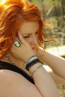
This picture I just loved and was so excited to edit it...


The model is gorgeous, the accessories are awesome and I was picturing a fantabulous composition~
But when I finished the final edits something was bothering me....can you tell what it is?


Her ring is UPSIDE DOWN and it was driving me crazy!

Now that may not be a deal breaker to you but I just couldn't let it go...so here's what I did...

I opened the final in photoshop elements 6 for mac...I duplicated the layer...then I selected just the ring with the Quick Selection Tool and put it on it's own layer and simply twisted it to where it was right side up~


And here's the "final" final...


So what do you think?  Would you have changed it too or am I just an obsessive freak?

BTW - (that's text talk for By The Way...I just learned that!)  I edited this photo with the Coffeeshop Orton Action and the PW Seventies Action.  Love the dreamy look it has~


Friday, April 9, 2010

Creative Motion Design

It's a cold hard fact ~ If you have a business you need a professional website.


Earlier this year I spent a lot of time researching "website sites" trying to decide which one was best for my business, Inspired by christy.  There's sooooo many good ones and I was a bit overwhelmed with the amount of sites tailored just for photographers.


I had already set up a site on Wix.com that was free, then upgraded to the $10 per month option to get the white branding bar off my site.  The Wix site was perfect for an inexpensive option but I just couldn't set it up like I wanted.  The interface was confusing to me but if you can figure it out I think it's an excellent option to start a website without a large financial commitment.


I ended up choosing Creative Motion Design for my new site and so far I really love it.  If you're in need of a new site I highly recommend this company.  I'll tell what I like the best about CMD...


Price
I'm working on a budget.  And although CMD isn't the cheapest, the price was reasonable for what I get with my site.  They often have 25% off selected templates and I bought the Armande template when it was on sale.  The hosting is $100 per year so I spent $321 total for the site and one year of hosting.  I think they have several of their templates on sale now if you want to take a look~


Proofing Cart
I really wanted a professional proofing cart that was attached to my site.  This not only gets my clients on the site again but also most people will tell their friends and family to take a look at their proofs.  


You know how women are...gotta call up their girlfriends and their mommas to check out their new pics!  


I also like the proofing cart because I'm in control of the size they're viewing their images at for the first time.   You can also have clients order prints and pay thru the proofing cart but I haven't set that up yet.  For now, I'd rather speak to them personally and give my recommendations for prints rather than leave them on their own.  


The main page opens to one single photo of my choice then they click thru to their gallery.  It looks like this...


Once the client is here they click the first thumbnail to see each image at the size I've put it to.  It's pretty easy for people to understand and I hear they're updating their proofing gallery soon to include lots more perks....can't wait!


Simple Interface
Before I committed to this site I downloaded the FREE 10 day trial...this is a great feature!  I was so surprised at how simple the site is to work in.  Here's a screenshot of the main page of my interface...


Seriously....it's soooo simple....and all updates are immediately active just like a blog.  There's no obligation if you do the trial but if you do decide to purchase the template all your trial info is saved and you don't have to start over.  Cool~

Customer Service 
I've admitted before, I'm a stalker.  These tendencies also carry over in the customer service realms of my world ~ if I have a question I will do the live chat while dialing the 800 # and emailing tech support all at the same time!  

CMD was *fabulous* in quickly responding to my emails and were very helpful on the phone.  They even extended my trial period when I had more questions for them.  I've read several reviews on all the template sites and there was good and bad about all of them.  But my experience with CMD has been superior thru the whole process and I can't say enough good things.

There's plenty more to rave about but I'm sure you get the point by now~  A few things I don't like are the small logo placement and the black text screens.  The text screen color can be changed for a small fee but it's not a priority for me right now.

Now, as usual, I would like your help with a few finishing touches on my site...here's my dilemmas ~

1.  Music or no music?  ...I just can't decide...I picked some pretty radical music to add but not sure it's jivin' with me...your opinion is welcome!

2.  I'm going to add a page that shows photos of a few of the specialty products I offer such as Accordion Brag Books, Albums, Metal Prints...should I add pricing info for the products or save that for interested parties only? 

Check out my site at inspiredbychristy.com and then share with me your opinions...good or bad...I can take it!

Tuesday, April 6, 2010

divawit3

First, the important stuff....
For those of you who asked, these *killer* jeans were purchased at a mall store called Buckle~


I'm wanting them too but doubt I can make them look near as good as she does!

I want to show you a few more of my shots from my Glam Redhead session.  I loved editing the images
from her shoot because I got to do some really dramatic, artsy style shots.  I learned quite a bit about skin editing too.  Seriously, the only way to improve is to practice ~ practice ~ practice!  This was a great learning experience for me...

Here's a more subtle portrait...
Original:


1.  I cropped and touched up her skin using Coffeeshop Baby Powder Room...just basic skin smoothing and a light glow.

2.  I added Dream Burst III texture from Kaleidoscope but erased it from her face, I just wanted it on the background...here's my screenshot:


3.  I ran PW Soft & Faded action at 100% to subdue the color.

4.  I ran Erin's Defog action at Pretty Foggy 70% 

Here's the final...


Here's another shot on the fence which showed off her great new figure...

Before ~


I didn't take screenshots but I cloned the grass in along the fence, then touched up her skin with Baby Powder Room and then added a few textures.  I ran the Coffeeshop Vivid 2 action to pop the colors at the end.

After ~


I'll be sharing more of my edits from this session soon...Stay Tuned~

Monday, April 5, 2010

Anatomy of...A Glam Redhead

I've had the extreme fun of doing some major girly Glam Experience sessions recently~


If you're not familiar with my Glam Experience, it's a session I've designed for the ladies that's all about confidence and beauty...about expressing that other part of yourself....the one that's
...fun
...flirty
...glamourous


I tell each lady that this session is not about photoshopping a whole new you...it's simply about showing off the you that often gets buried at soccer practice...dance class...and staff meetings!


I made these postcards to advertise my Glam Experience...I had them printed at vistaprint for FREE!  I love vistaprint!


This past weekend my friend divawit3 totally rocked out her Glam session!  
Not only is she always stylin' with a gorgeous mane of bright red hair, but she also just lost over 40 pounds in the last 6 months!  She literally worked her butt off!  

Here she was last September when I did her family pics...she was wanting to hide behind her kiddos in all the pictures...


...and here she is now...not hiding a thing~


All the shots above were edited the following way...
1.  I did some basic cloning under the eyes to lighten any dark spots then a few touches with the healing brush.
2.  I edited the skin with Coffeeshop Baby Powder Room
3.  Used Pioneer Woman PW B&W action and tweaked the lightness to the desired look. (I added a light texture on the last shot just around the edges)

Here's a few more...I love love love the PW Seventies action so I created the following images using that action...with a few tweaks of the hue/saturation to achieve the soft look...

Before ~


After ~


Before ~ 


After ~ 


Those edits were super simple...just the Coffeeshop Baby Powder Room on the skin, a few touches of sharpening on the jewelry accessories and the PW Seventies action adjusted to taste.  Try It!
 
And of course I had to showcase that *fab* red mane of hers...


Last but not least...what's a girl do when she's been sweatin' for 6 months getting her butt in shape??

She works them jeans!!


A huge thanks to divawit3 for letting me show off all her pics here to the world!  

I'll try to have some more before & afters from this session later this week...she was just such a perfect model...there were too many great ones to choose from~


And if you haven't shot a Glam session before I encourage you to get out there and do it!  Grab your girlfriends and go have some girly fun for the day...try some dramatic shots...some flirty shots...some fun shots...then hand the camera over to your girlfriend and YOU be the subject for once!
 
Blog Designed by Rita of CoffeeShop