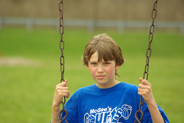
Well, it was nothin' fancy, just a perfect example of how a 70-300 lens gives awesome bokeh!
My focal length was at 190mm when I shot this.
Here's my original, which is pretty darned perfect as-is...not talking about my skills, simply referring to Rebel's friend as my fabulous model~

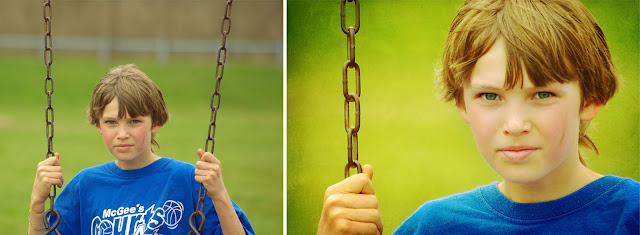
I just loved this shot but of course had to mess with it a bit. I actually did very little editing to my first attempt...I softened the skin just a tiny bit...then I added a subtle scratchy texture that darkened the edges...then I popped the color with Coffeeshop Vivid 2 on the Soft option.

I played with it a few other ways too...black and white using Coffeeshop Bittersweet Vintage and B&W on the High Key option...I erased just a little on his skin as you can see in my screenshot...but I made sure to keep that mud swipe untouched...boys look good in mud!
...to get this...
Whoops - forgot to tell you that I cloned out the writing on his shirt...I thought it was distracting. I just used the clone stamp and stamped over it using the color from other parts of his shirt.
Then I got really funky and did this...
...just havin' some fun and playin' around with blending modes~
Give it a whirl...try all of them! I think I duplicated then used Soft Light....then duplicated and used Multiply...then used Screen and kept his face lighter but erased the Screen off the background...I bet I tried at least 12 different combination of modes...then finished it off with a texture from ShadowHouseCreations.
I like all of these finishes but still think my original looks great. Like I've said before...actions and textures and editing doesn't necessarily make a photo better...just different~
{my photos have been lookin' a bit pixely lately here on my blog. I think it's because I'm letting blogger choose the size instead of doing it myself. It's pure laziness on my part...I reduce them for the web with Size It but then let blogger resize them again...learn from my mistakes and size your photos correctly if you want them to show nice on your blog!}


4 comments:
Thanks so much! I really like the B/W edit, but the first one is absolutely perfect! Thanks for letting us know how you did it!
first of all, the original is fantastic! Second, I'm totally envious of your editing skills :D
And thank you for sharing, I'm learning so much from you :)
This photo took nicely to many different edits. It sounds like you edit a lot like me...a little bit of this and a little bit of that! :)
Oooh I'm going to try this too...and I've noticed my pictures looking weird too! Thought it was just me.
Post a Comment